blog

Carol + Stephen | Old Home Wedding

dayof_2
Image by Jenna Kutcher @ photosbyjennaleigh.com

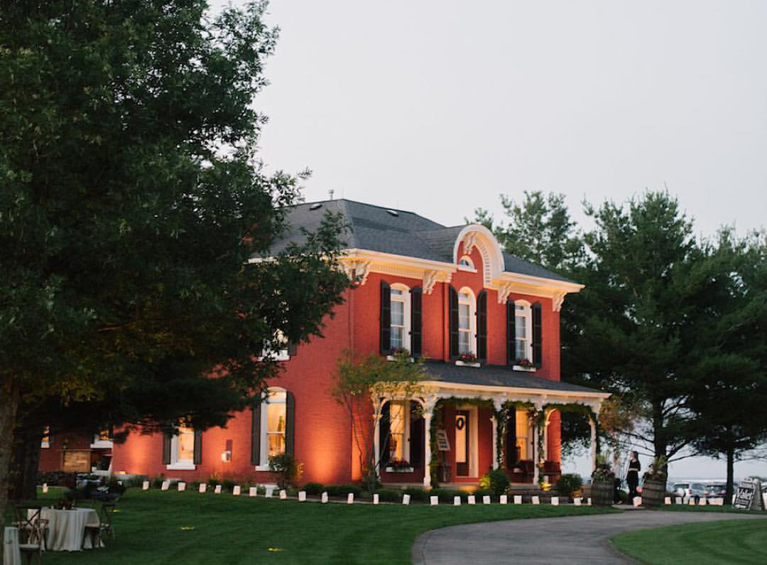
That old red home. With its Italianate detailing, white front porch and corbels, contrasted to vibrant red brick, it is a house that carries the stories of generations. Standing the test of time, and coming back into the family’s hands again, the house was lovingly restored to its original grandeur by a grandson whose grandmother was born in the house and played on the front porch as a child. After seeing the first location photo, I knew immediately it was going to become the centerpiece to one of the most memorable events ever witnessed at this home and beyond.

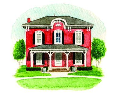
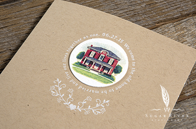
Given the nod by Cherry Blossom Events, and our couple, Stephen and Carol, we were asked to create a “homespun” wedding invitation suite that conveyed the importance of the home in Stephen and Carol’s lives. Before we even put a first concept together, we contacted Sarah Barga Pollasch. I had seen her illustration work as a college student several years ago and knew that this was the right project for her undertaking and our first collaboration. Newly minted to California (thank goodness for Google search), she was put in charge of creating an original watercolor of the house. Her work is exquisite and we were not at all surprised by the outcome.

oldhome
Watercolor illustration by Sarah Barga Pollasch, copyright SBP and SRS.

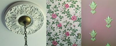
Pairing the original artwork in hand, we used remnants from actual wallpaper from inside the home. A fleur de leis and a latticed floral patterns were illustrated from the original photographs, and incorporated into our first and only concept. Spot on.

wallpaper

A statement wrapped in a circular embrace around the watercolor, “We come to the old home to be married and live our lives together as one,” ended up carrying the theme throughout the suite and event. I was so tickled to see it fronted on the welcoming sign on their wedding day. A day with the home, the couple, the details, the messaging, and style made it one of the most meaningful and carefully planned and executed events we’ve ever been involved with. A big nod to Cherry Blossom Events for adding in so many layers of detail that made this event extra perfect in so many ways.

carol_stephen_02carol_stephen_01carol_stephen_03_lr


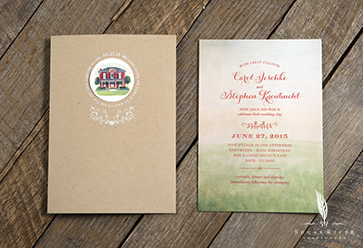
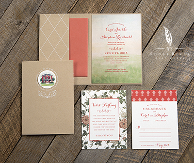
The invitation suite features a combination of full color offset printing and silkscreen. The papers were also mixed (color and textures) to give it an eclectic, yet harmonious look and feel.

Be sure to check out captures from this stunning events at Photos by Jenna Leigh (http://photosbyjennaleigh.com/blog/stephen-carol-private-residence-wedding). Special thanks to Cherry Blossom Events (http://www.cherrybevents.com) for including us in the mix on this project.

Ivana + Ryan | Summer Wedding


ivana_ryan_3

This suite will forever hold my heart as it was done for my bestie, Ivana, and her Match, Ryan.

Ryan, you see, is very lucky guy to have found this strikingly beautiful (and very tall) woman who will want nothing but to spoil him rotten. For a girl who listened to the Food Network as background noise, and who I practically begged to send in an application to Top Chef/Gordon Ramsey, Ryan has effectively ended his days as a misfed bachelor. I’m sure there’ll always be a decent home cooked meal paired with the perfect wine or beer if he just asks nicely! And don’t worry about him mismatching or updating his wardrobe, she will have that covered too.

I’ve known Czech-import Ivana for more than 20 years (I actually knew her before I met her but that’s a long, off point story). She is a classic beauty, with an eye for clean lines, no mess and impeccable style. I should not have been shocked by her mostly single-color sweater collection although later it made complete sense. It’s uncomplicated just like she is. From family vacations, weekday and weekend exploits, and to helping me to experience college life after I graduated from college, she is a forever friend, and I too, am so lucky to have found her and have her as my bestie.

So, when I heard they were getting married and wanted us to design their invitations, I was over the moon for her, but then overly anxious. How could I ever design something that was true to someone who means so much to me? There are so many things I can think of in the 20 something years we’ve put away together. So many memories, but I had to focus on theirs together not mine.

Getting down to creating their stationery suite wasn’t very easy. I wanted to include all sorts of tie ins to their wedding day from the tactile feel of the invite itself, to the message we wished to convey. Of the concepts we developed, this one was the one I felt strongest to. Their chosen venue, Appleton’s historic, Paper Discovery Museum, perched along the banks of the Fox River, pointed us to the Old World-master printing method of letterpress paired with gritty and seemingly imperfect papers. Those picks proved to be an excellent pairing to the solid green ink used throughout the suite. It was subdued, but bold at the same time. A classic look.

For design, we wanted a format that was different. We don’t do square invites very often and I felt that using a square was different and might help to show off a fully justified layout – framed by clean lines and white space. We incorporated old book style, elegant serif typeface for a lighter look and feel (Ivana is an avid book reader, so it made a good connection too). We also included a silhouette of a dachshund as a memento of Ivana’s puppy, Zoe, who was Ivana’s faithful sidekick for 16½ years. Zoe was in the design process all along, barking at me to close the file so she could have Ivana all to herself (whenever I called Ivana, Zoe would undoubtedly start barking until we hung up).

ivana_ryan_1

To provide flexibility in the suite, we introduced a pattern on a couple of elements including the back of the invitation. Since Ivana and Ryan planned their honeymoon for Barcelona, the pattern we used is a pull from an artifact of Andalusian tile.

Privy to their wedding day, the I Dos came off without a hitch in 4 minutes and 36 seconds. Aud got it on tape. Great food, great wine, great venue along the river. A happy couple and a so very happy for them friend! Ahoj!

ivana_ryan


Bethany + Simon | Summer Wedding

SRS_BS_15_4

This suite has so many interesting aspects that I’m sure I’ll forget one or two, but it stands as one of those projects that is “art on paper”. Seems fitting that it was for an event in a modern art museum and within the quirky, eclectic atmosphere that downtown Madison is well known for.

First, let’s start with the invitation. It begins as our third “home run” collaboration with the talented, Steph Davies http://www.stephdaviesartmusic.com who continues to create a plethora of material for us to work with. We were provided original pen and ink illustrations of State Street curbside, Madison Museum of Art (MMOA), and a stunning roof top view. Illustrations were pulled into the invitation design and Save the Date (not pictured) projects, preserving the quirky nature of Steph’s drawings. Complementing her work includes a modern font and a stylish handwritten script with graffiti-like undertones for a bit of urban flair.

SRS_BS_15_2

Paying homage to things old, we found a small architectural artifact on the rooftop of MMOA to play the centerpiece of a laser cut pocket which housed the invitation items. The pocket was created from a paper made from silk fibers that offers a very reflective, high-end, and luxurious look. This piece in particular provided us with some production challenges when it comes to the maximum light intensity of the laser on silk (prompting the mill to ask us for finished samples for their production specifications book), but in the end, we mastered it and all was good.

SRS_BS_15_3

Complementing the bold blue and black inks on white stocks, is a muted papaya colored stock. These items were printed with silkscreen using the bold blue ink for a lively contrast and tie back to other elements.

A big “thank you” goes to Bethany, Simon and Cherry Blossom Events (Madison, WI)  www.cherrybevents.com for including us in the mix.

What’s your story?

1378358_10151912117596907_337982624_n


The response is almost always the same, “Our work can tell a story.”

Many of our projects over the years provide testament to that thought and this year has been no exception. From a family heirloom home being restored to its original grandeur to become the centerpiece to a wedding celebration, to conveying the often morbid, but important, working relationship of two forensic scientists, or the tiny placement of a traveling garden gnome, our projects typically find their footing in being distinctive, fun and memorable. As we meet with clients, and the brainstorming process begins, we usually look beyond the obvious and work to mine out the important details that really drive home a complete story. We want our work to be so unique that anybody would leap at the chance to be able to come and share the day.

So it’s safe to say that we find it challenging to design invitations that are text on paper and mailed in a plain envelope. Our work strives to be engaging, thought provoking, and different. We push the envelope (for lack of better words), to try new things, challenge our team and be the best we can. It’s a mantra we follow and will always.

We look forward to sharing our projects and process with you through our new website and blog. Thank you for visiting. We have many stories to share.